

In today's digital landscape, mobile devices are everywhere, playing an important role in our daily lives. With the majority of internet users accessing the web through smartphones and tablets, the importance of delivering exceptional mobile User Interface (UI) and User Experience (UX) design cannot be overstated.
As businesses strive to attract and retain users in the competitive mobile market, adhering to mobile UI/UX design best practices is paramount.
Mobile UX design is not just about shrinking desktop interfaces to smaller screens. Instead, it requires a holistic approach that considers the unique characteristics and constraints of mobile devices, while prioritizing user needs and behaviors.
Let's dive into the essential guidelines for crafting seamless mobile UI/UX design!
Prioritize Usability
Usability lies at the core of effective mobile UI/UX design. Emphasize clarity, simplicity, and efficiency. Designers should prioritize intuitive navigation, minimize cognitive load, and streamline interactions to ensure a smooth user experience. User testing and feedback play a crucial role in identifying usability issues and refining design solutions.
Optimize for Touch Interaction
Unlike desktop interfaces, mobile devices rely primarily on touch input. Designing for touch requires larger tappable areas, sufficient spacing between elements, and intuitive gesture-based interactions. The ideal touch target size should be at least 7-10mm to accommodate users' fingers accurately. In addition, providing visual feedback for touch interactions increases the perceived responsiveness of the interface.
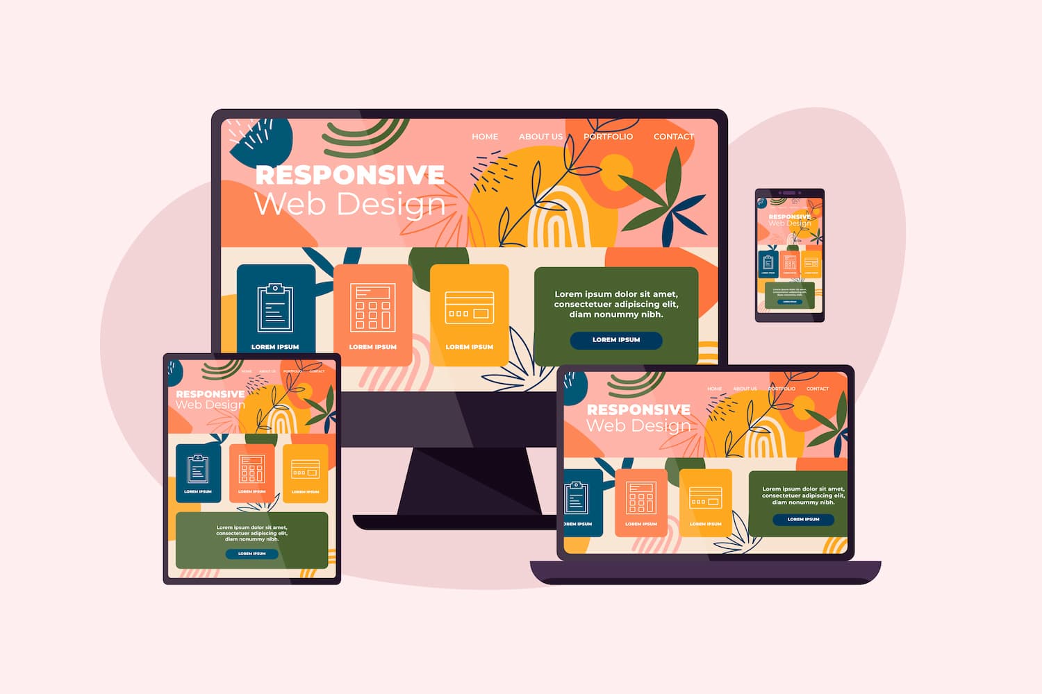
Responsive Design for Multi-Device Compatibility
With a wide range of (mobile) devices available in the market, designing for responsiveness is essential to ensure a consistent experience across various screen sizes and resolutions. Responsive design techniques, such as fluid layouts and scalable assets, enable seamless adaptation to different devices without compromising usability or visual coherence.
Embrace Mobile-First Approach
In today's mobile-centric world, adopting a mobile-first approach has become essential for successful UI/UX design. By starting the design process with mobile constraints and priorities in mind, designers can create leaner, more focused experiences that resonate with mobile users' preferences and behaviors. This approach also ensures scalability, as designs can be progressively enhanced for larger screens. (However, be careful. Mobile-first does not mean mobile-only!)
Performance Optimization
Mobile users expect fast and responsive experiences, making performance optimization a critical aspect of mobile UI/UX design. Minimizing loading times, optimizing image and video assets, and leveraging caching mechanisms are some strategies to improve performance and reduce friction in the user journey.
Conclusion
Crafting seamless mobile UI/UX design requires a comprehensive understanding of user needs, platform constraints, and design principles. By prioritizing usability, optimizing for touch interaction, embracing responsive design, adopting a mobile-first approach, and optimizing performance, designers can create compelling mobile experiences that resonate with users and drive engagement.
As mobile technology continues to evolve, staying on top of emerging trends and user preferences remains essential for delivering exceptional mobile UI/UX design.


