Imagine stepping into a new gym for the first time.
You're greeted by staff who give you a tour of the facility, showing you around the various workout areas and amenities. They introduce you to the equipment, and they inform you about the different classes available, from yoga to TRX. This onboarding experience ensures that you feel welcomed, informed, and ready to kickstart your fitness journey with confidence!
Similar to this experience, mobile apps also guide you through their features and functionalities, using onboarding screens. Let’s explore this in detail.
What is Onboarding?
Onboarding is the process of getting users familiar with a new interface. It's like the first chapter of a book, setting the stage for what's to come. Onboarding screens can include tutorials, interactive elements, and brief explanations to help users get started smoothly. Essentially, it's about making the initial user experience as seamless and informative as possible.
Contrary to popular belief, it's not just about familiarizing users with interface interactions but also includes the essential task of completing any setup requirements. Moreover, onboarding extends its reach beyond the initial voyage of first-time users; it extends its welcoming embrace to existing users when new features or redesigns make their debut.
When to Use Onboarding Pages
Complexity: If your app has complicated features or workflows that might not be immediately obvious to users, onboarding can help guide them through.
Example: A project management app might use onboarding to explain how to create projects, assign tasks, and track progress.
New Features: Whenever you introduce significant updates or new features, onboarding can inform existing users about these changes and how to leverage them effectively.
Example: Social media platforms often use onboarding to introduce new features like stories, reels, or live streaming.
Value Proposition: Onboarding is an excellent opportunity to showcase the unique value proposition of your app and hook users right from the start.
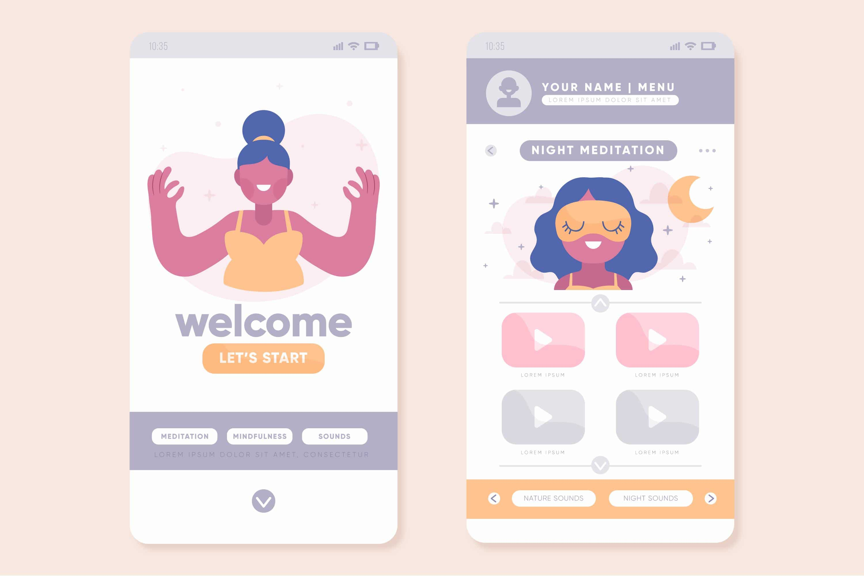
Example: A meditation app might use onboarding to highlight its guided meditation sessions, personalized recommendations, and progress-tracking features.
User Engagement: If you want users to explore various features of your app and understand its full potential, onboarding can encourage them to do so.
Example: A fitness app might use onboarding to encourage users to set up their fitness goals, track workouts, and explore meal plans.
When and Why -NOT- to use Onboarding pages
While onboarding may seem like a necessary component for every app, it's essential to critically evaluate its benefits against its potential drawbacks. In many cases, users can learn to navigate an app organically through exploration and context-based guidance, making lengthy onboarding processes unnecessary.
Here are some reasons on why not to use them:
Higher Interaction Cost: Implementing onboarding flows adds an additional step for users, increasing the interaction cost of using your application. Even if users choose to skip onboarding, they still must take action to do so, potentially hindering the smooth flow of their experience within the app.
Interaction Cost: The interaction cost is the sum of efforts — mental and physical — that the users must deploy in interacting with a site to reach their goals.
Memory Strain: Onboarding often relies on users remembering specific details about the interface, such as icon meanings or navigation steps. However, human memory is limited, and asking users to remember too much can strain their cognitive load.
Experts' Recommendation: Given the drawbacks and potential inefficacy of onboarding, professionals are advised to avoid creating onboarding flows whenever possible. Instead, prioritize efforts to enhance the usability of the app's interface, making it more intuitive and user-friendly for both new and existing users.
Examples of Onboarding Cases
The following examples represent a few, simple onboarding experiences that aim to introduce users to the app's features and functionalities in a clear and user-friendly manner.
Welcome Screens: A simple welcome screen with a brief message welcoming users to the app and prompting them to get started. This can include a call-to-action button to begin exploring the app.

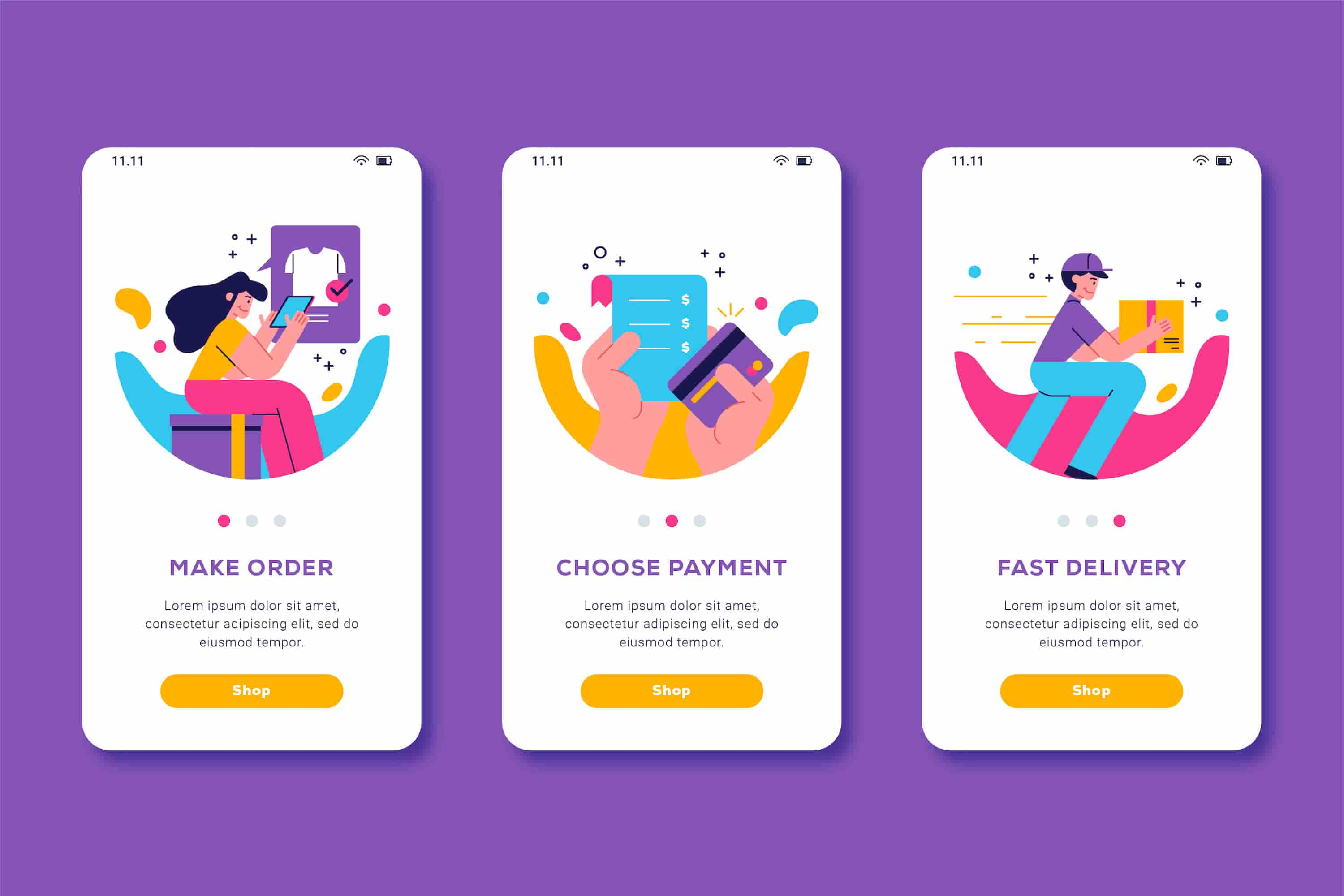
Feature Highlighting: Showcasing key features of the app with short descriptions and visual cues. Each feature is presented on a separate screen, allowing users to understand the app's functionalities quickly.

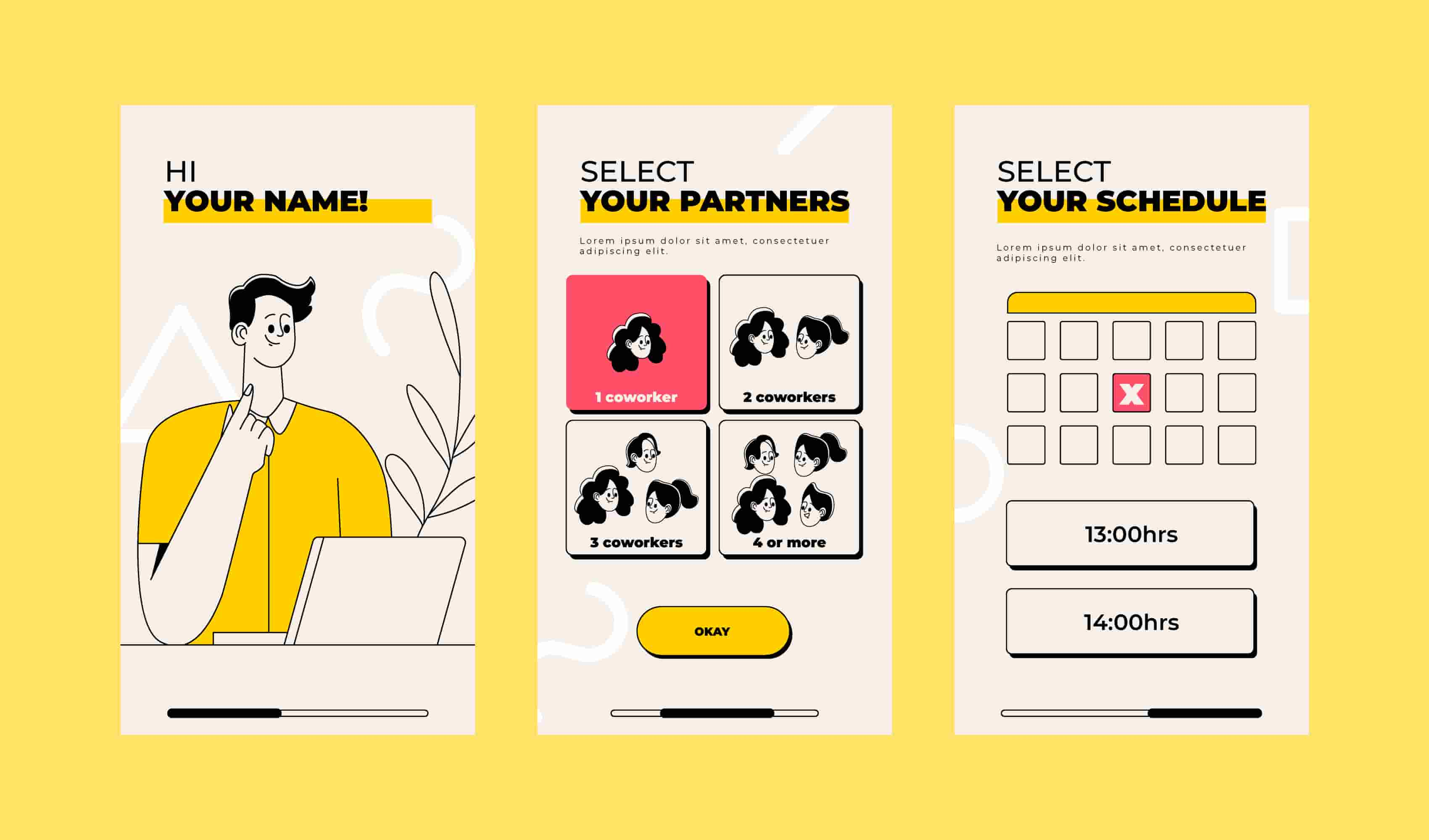
Setup Guide: A brief setup guide helps users configure the app seamlessly. With clear instructions and visuals, users can create accounts, set preferences, and connect devices, ensuring a smooth start to their app experience.

All mockup images have been retrieved from Freepik for the purpose of this article.
Conclusion
In conclusion, onboarding plays a pivotal role in introducing users to the interface of mobile apps. It serves as the initial guide, ensuring users feel welcomed, informed, and ready to embark on their journey with confidence. While onboarding is beneficial in many cases, it's crucial to recognize situations where its implementation may not be necessary or may even have potential drawbacks. By carefully evaluating the need for onboarding and considering its potential impact, designers can create a seamless and user-friendly experience that fosters user engagement and satisfaction.

