Breadcrumbs and back buttons are essential navigational tools in user interface (UI) and user experience (UX) design. They help users retrace their steps and provide context within a website or application.
Breadcrumbs
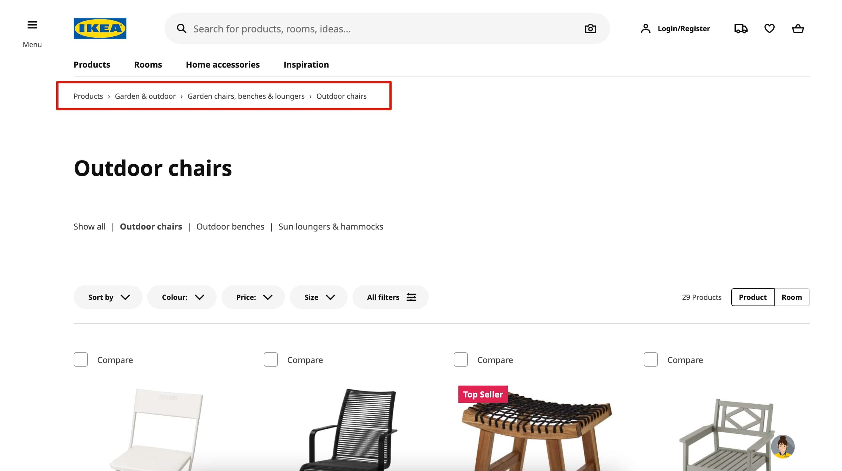
Breadcrumbs are hierarchical navigation aids that allow users to see their current location within a website's structure. They are particularly useful in sites with deep, multi-level navigation, helping users easily move to higher-level pages. Breadcrumbs are best used in complex sites where users need to understand the path they’ve taken.

When to Use Breadcrumbs:
-
Deep Navigation Structures: Ideal for websites with multiple levels, such as e-commerce sites or government portals.
-
Clear Hierarchy: Breadcrumbs work best when a site has a well-defined, hierarchical structure.
-
Contextual Navigation: Breadcrumbs provide context, showing users exactly where they are and allowing them to navigate back without using the browser’s back button.
Back Buttons
Back buttons, often found in web browsers or within apps, are simple tools that let users return to the previous page they were on. They are familiar and universally understood, making them a fundamental part of navigation.
.jpg)
When to Use Back Buttons:
-
Linear Navigation: Back buttons are most effective in applications or websites where navigation follows a linear path.
-
Temporary Actions: Useful when users need to return after a temporary diversion, such as checking a product detail and then returning to a product list.
-
User Control: Back buttons give users control to revert actions or decisions, enhancing the sense of exploration without the fear of getting lost.
Best Practices
-
Visibility: Ensure breadcrumbs are easy to find, usually placed near the top of a page.
-
Consistency: Use consistent symbols and labels in breadcrumbs to avoid confusion.
-
Non-Intrusive: While back buttons are vital, they should be discreet and not compete with other navigational elements.
In conclusion, while breadcrumbs and back buttons serve distinct roles in navigation, their strategic use together can significantly enhance user experience, especially on complex websites or applications. However, it's crucial to assess the specific needs of your users and the structure of your site to determine whether both are necessary. A well-balanced approach can streamline navigation, reduce user frustration, and optimize the overall experience.

